Allmystery
Menschen Wissenschaft Politik Mystery Kriminalfälle Spiritualität Verschwörungen Technologie Ufologie Natur Umfragen Unterhaltung
weitere Rubriken
PhilosophieTräumeOrteEsoterikLiteraturAstronomieHelpdeskGruppenGamingFilmeMusikClashVerbesserungenAllmysteryEnglish
Diskussions-Übersichten
BesuchtTeilgenommenAlleNeueGeschlossenLesenswertSchlüsselwörter
Schiebe oft benutzte Tabs in die Navigationsleiste (zurücksetzen).

Code- und Designerecke für Allmy Profile und Blogs

48 Beiträge ▪ Schlüsselwörter: Hilfe, Blog, Profil ▪ Abonnieren: Feed E-Mail

Code- und Designerecke für Allmy Profile und Blogs

21.01.2016 um 04:17
Ein herzliches HALLO an alle ;)

pc

Ich bin S_C, ein Allmy Profil- und Blog "Designer", der den interessierten Usern immer wieder und sehr gerne mit Codes, Grafikelementen sowie Tipps und Tricks für deren individuellen Profil- und Blog Designs zur Verfügung steht. Der eine oder die andere unter euch kennt mich vielleicht. ;)

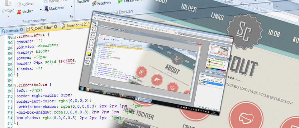
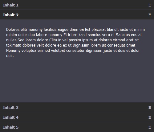
Mit dieser Gruppendiskussion möchte ich einen Raum schaffen, in dem andere "Nerds" aus den Bereichen Allmy Coding und Design ihre Arbeiten vorstellen und die vollständigen CSS-, HTML- und Grafikdateien und -elemente der Community zur Verfügung stellen können.

Der User Support für die kopierten Codes läuft über @yaacool 's berühmten Do it yourself: CSS für Profil und Blog . Dort können Fragen und Hilfen zum Aus- bzw. Umbau gestellt und angefordert werden.
Selbstverständlich nehmen wir auch "Aufräge" an und gestalten Designs nach eigenen (machbaren) Vorstellungen :Y:

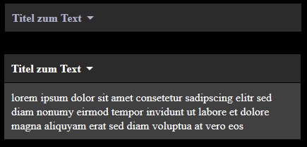
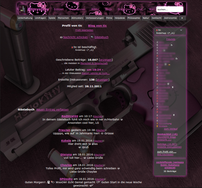
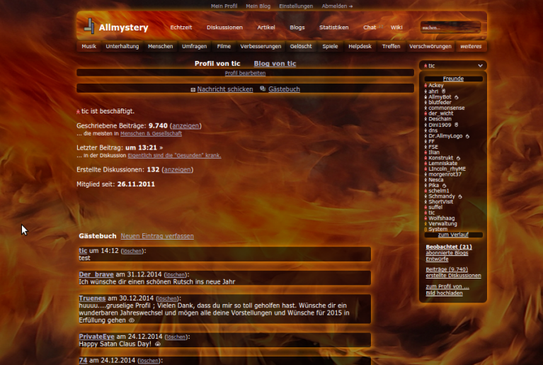
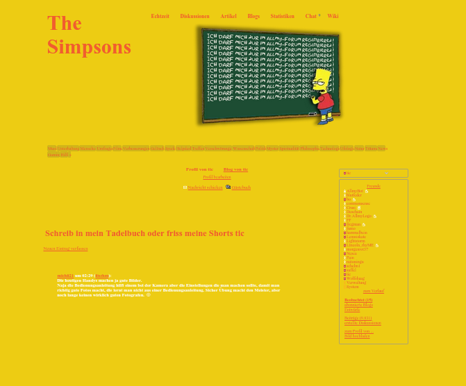
Bevor ich jetzt lange den Ablauf erläutere, stelle ich mit dem nächsten Beitrag ein kleines Profil Theme als Beispiel zur Verfügung. Wichtig ist mir nur, dass jeder Designer pro Beitrag nur EIN Theme bereitstellt. Diskussionen zum Gruppenthread bitte nicht hier, damit der Raum für unsere Interessenten übersichtlich bleibt.

Ich freue ich mich sehr auf das Mitwirken weiterer Freunde und Kollegen und vor allem darauf, dass viele User unser Angebot nutzen!

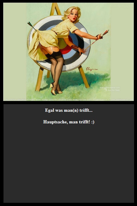
Ein schönes Profil oder Blog Design ist die User Sedcard in einem sonst virtuellen Raum.


Herzlichst, euer

7a326e s c-logo2

Anzeige
1x zitiert1x verlinktmelden

Code- und Designerecke für Allmy Profile und Blogs

21.01.2016 um 04:28
BUDDHA | Profile Theme

Ein kleines und unkompliziertes Theme für Anhänger und Liebhaber seiner Religion & Weisheiten:

S C-Buddha ThemeOriginal anzeigen (0,2 MB)

Ein Hintergrund Sound ist bereits integriert, die Grafiken können natürlich über den eigenen Uploader ins Theme eingebaut werden.

Der Code

<style type="text/css"> /* Buddha Theme Author: S_C (https://www.allmystery.de/mitglieder/S_C) */ /* -----### Allmy Layout ###----- */ /* ausblenden */ .header_info, .profile_links, .profile_info, .head_links, #header, .header, .tabnav, .footer, .infoleiste, .mcell2, .mcell_inhalt2, .mcell_inhalt3, #mstatus_content, .infoleiste img, .gb_post_usericon, iframe { display: none !important; } body { width: 100% !important; margin: 0px auto 0px auto; padding-top: 0 !important; font-family: Palatino Linotype !important; font-size: 16px; font-weight: 300; background-color: #b4b48d; line-height: 1.1; text-align: center; background-image: url("https://static.allmystery.de/upics/282496_buddha.png"); background-repeat: no-repeat; background-position: top center; background-size: cover; background-attachment: fixed; } .page { width: 100% !important; min-width: 0px !important; max-width: 100% !important; } .main { clear: both; width: 100% !important; margin-right: 0px !important; padding-top: 0px !important; padding-right: 0px !important; padding-left: 0px !important; height: auto !important; background: transparent; } a, .userfunction, .userfunction a, .infoleiste, .infoleiste a, .userfunction button { font-family: Palatino Linotype !important; font-size: 16px; color: #B4B48D !important; } .userfunction a:focus, .userfunction a:hover, .userfunction button:focus, .userfunction button:hover { color: #5a180d !important; } center { padding: 0; position: relative; text-align: center; } a#show_gb_post_wrap { width: 300px; font-family: "Cutive Mono","sans-serif" !important; font-size: 20px; font-weight: 600; color: #5A180D !important; text-decoration: inherit; margin: -20px auto 0px auto; padding: 0px; cursor: pointer; text-align: center; display: block; } a#show_gb_post_wrap:focus, a#show_gb_post_wrap:hover { color: #960725; } #gb_post_wrap { float: none; width: 500px; height: 120px; padding: 0px; margin: 0px auto 20px; border: 0px solid #5A180D; border-radius: 5px; color: #000; background-color: transparent; } #gb_post_textarea { position: relative; padding: 5px; width: 500px; height: 90px; min-height: 90px; margin: 0 auto; left: 0 !important; font-family: "Cutive Mono","sans-serif" !important; font-size: 16px; color: #000; border: 1px solid #5A180D; background: #B4B48D none repeat scroll 0% 0%; opacity: 0.8; filter:Alpha(Opacity=80); } #gb_post_submit { font-family: "Cutive Mono","sans-serif" !important; font-size: 20px; font-weight: 600; color: #5A180D; border: 1px solid transparent; padding: 0px; background: transparent; cursor: pointer; width: 500px; left: 0; top: 100px; } #gb_post_submit:focus, #gb_post_submit:hover { color: #b4b48d; } ul#gb_posts { width: 500px; margin: 0px auto 10px !important; position: relative; } ul#gb_posts li { margin-bottom: 30px; float: none; text-align: center !important; width: 500px; display: inline-block; position: relative; } #gb_posts li a.gb_post_img { width: 150px !important; height: 100px; float: none !important; display: block !important; margin: 0px auto !important; text-align: center !important; background: transparent url("http://www.allcrime.watch/allmy_styles/Stern90/bg_avatar.png") no-repeat scroll center top; } #gb_posts li a.gb_post_img:focus, #gb_posts li a.gb_post_img:hover { -webkit-transform: translate(0px, -5px); -moz-transform: translate(0px, -5px); -ms-transform: translate(0px, -5px); -o-transform: translate(0px, -5px); transform: translate(0px, -5px); opacity: 0.8 !important; cursor: zoom-in; } .gb_post_text { width: 500px !important; font-size: 16px !important; font-weight: 600; color: #000; margin: 0px; line-height: 1.2; } .gb_post_text a { font-family: Palatino Linotype; font-weight: 300; font-size: 16px; text-transform: uppercase; color: #5a180d; font-weight: 300; } .gb_post_text a:focus, .gb_post_text a:hover { color: #b4b48d; } .gb_post_text strong { font-family: Palatino Linotype !important; font-weight: 300; font-size: 18px; color: #5a180d; text-transform: uppercase; } #gb_posts li a.gb_post_img img { width: 80px; height: 80px; padding: 10px; border: 0px solid #5A180D; border-radius: 70px; opacity: 0.8; margin-top: 5px; } .profile_pic { float: none; display: block; } a, h1 a, .userfunction a, .link_button a, #gb_post_submit, .userfunction button { -webkit-transition: all 0.7s ease-in-out; -moz-transition: all 0.7s ease-in-out; -o-transition: all 0.7s ease-in-out; transition: all 0.7s ease-in-out; text-decoration: none; } a:focus, a:hover, .userfunction a:focus, .userfunction a:hover, .link_button a:focus, .link_button a:hover, #gb_post_submit:focus, #gb_post_submit:hover { opacity: 0.8; } .user_view { width: 85px; height: 85px; margin: 0px 60px 0px 60px !important; float: none !important; display: inline-block; border-radius: 50%; background: transparent url("https://static.allmystery.de/upics/7f9502_bg_avatar.png") no-repeat center top; } .user_view a img.user_view_pic { border-radius: 50%; padding: 0px !important; margin: -2px 0px 0px !important; float: none !important; border: 0px solid #FACB3D !important; width: 65px !important; height: 65px !important; background-color: transparent; } .user_view a { text-align: center; border-radius: 50%; float: left !important; color: #000 !important; width: 85px; font-size: 18px; } .user_view a:hover { color: #7AC0C0 !important; } .user_view .visited_info { width: 85px; font-size: 14px !important; display: block; float: left !important; text-align: center; margin-top: 10px; margin-bottom: 30px; color: #000; } a[href^="/mitglieder/"] { margin-top: 15px; } .bild { max-width: 500px; margin: 10px auto; position: relative; display: block; } /* -----### Buddha Layout ###----- */ * { box-sizing: border-box; } object { width: 200px; margin: 20px auto 0px auto; padding: 0px; text-align: center; background: rgba(255, 255, 255, 1.0); display: block; cursor: pointer; position: relative; } .profile_content { width: 600px; margin: 0px auto 0px auto; padding: 0px; background: transparent; text-align: center; position: relative; } .header_info { border-color: transparent !important;; border-width: 0px !important; width: 880px !important;; } h1 { width: 100%; margin: 0px auto; padding: 0px; font-family: Palatino Linotype !important; font-size: 20px; font-weight: 400; text-align: center; position: relative; display: block; } h1 a { color: #5a180d !important; text-decoration: none; text-shadow: 3px 3px 0px #b4b48d; font-size: 40px; opacity: 1.0; filter:Alpha(Opacity=100); } h1 a:focus, h1 a:hover { color: #000; text-shadow: 3px 3px 0px #b4b48d; opacity: 0.7; filter:Alpha(Opacity=70); } #welcome { width: 100%; margin: 30px auto 0px auto; padding: 0px; text-align: center; font-size: 24px; font-weight: 600; color: #5a180d; position: relative; display: block; z-index: 99999; } #member { width: 100%; margin: 40px auto 0px auto; padding: 0px; text-align: center; font-size: 32px; font-weight: 600; color: #000; text-transform: uppercase; position: relative; display: block; z-index: 99999; } #motto { width: 100%; margin: 30px auto 0px auto; padding: 0px; text-align: center; font-size: 24px; font-weight: 400; text-transform: uppercase; color: #000; position: relative; display: block; z-index: 99999; } .ctn_pics-top { width: 100%; margin: -50px auto 30px auto; padding: 0px; background: transparent none repeat scroll 0% 0%; text-align: center; position: relative; display: block; } .ctn_pics { width: 100%; margin: 0px auto 40px auto; padding: 0px; background: transparent; text-align: center; position: relative; display: block; } .ctn_line { width: 100%; margin: 0px auto 40px auto; padding: 0px; background: transparent none repeat scroll 0% 0%; text-align: center; position: relative; display: block; } h2 { width: 100%; margin: 0px auto 30px auto; padding: 0px; text-align: center; font-size: 18px; font-weight: 600; color: #000; text-transform: uppercase; position: relative; display: block; } h3 { margin: 20px auto 0px auto !important; font-family: Palatino Linotype !important; font-size: 20px; color: #000; font-weight: 600; line-height: 1.1; text-align: center; display: block !important; } a:hover, .infoleiste a:hover { color: #960725; } .more_entries_wrap { max-width: 500px; float: none !important; position: relative; text-align: center; margin-bottom: 30px !important; margin-right: auto !important; margin-left: auto !important; } </style> [IMG]/static/upics/87fcc0_lotus.png[/IMG] [size=3] [url=http://www.allmystery.de/themen/km]User Nick[/url] [/size] $mbesucher [IMG]/static/upics/761f90_user_bottm_line.png[/IMG] Herzlich Willkommen auf meinem Profil! Nichts ist für die Ewigkeit. Nichts bleibt wie es war. [IMG]/static/upics/a8f59e_line.png[/IMG] [IMG]/static/upics/59365c_symbolik.png[/IMG] [IMG]/static/upics/a8af87_symbol1.png[/IMG] [size=3]Großes Verstehen kommt mit großer Liebe.[/size] [IMG]/static/upics/a8f59e_line.png[/IMG] [size=3]In der Erfahrung der Liebe beginnt die Welt aufs Neue. In jedem Augenblick. Die Liebe nimmt nicht, sie gibt.[/size] [IMG]/static/upics/a8f59e_line.png[/IMG] [size=3]Wonach suchst Du? Nach Glück, Liebe, Seelenfrieden? Suche nicht am anderen Ende der Welt danach, sonst wirst Du enttäuscht, verbittert und verzweifelt zurückkehren. Suche am anderen Ende Deiner selbst danach, in der Tiefe des Herzens.[/size] [IMG]/static/upics/a8f59e_line.png[/IMG] [size=3]Du bist nicht auf der Erde, um unglücklich zu werden. Doch Glück ist allein der innere Frieden. Lerne ihn finden. Du kannst es. Überwinde dich selbst und du wirst die Welt überwinden.[/size] [IMG]/static/upics/a8f59e_line.png[/IMG] <iframe class="mysong" frameborder="0" height="0" src="/fcgi/?m=profile&ytid=KbCkT9A9Xp0" width="0"></iframe>

Viel Spaß!

Herzlichst, euer

S_C


melden
tic ehemaliges Mitglied

Link kopieren
Lesezeichen setzen

Code- und Designerecke für Allmy Profile und Blogs

21.01.2016 um 04:48
Guten Morgen :D

Wie manche von euch vermutlich wissen erstelle ich die Allmystery-Styles die man Installieren kann und die das Gesamte Forum-Design ändern (abgesehen von Profil und Blog)

S_C hatte die Wunderbare Idee für diesen Thread an dem ich mitwirken werde :)

[wer die Allmy-Styles von mir noch nicht kennt, hier der Thread der sich darum dreht und wo ich verschiedenste Styles und "Erweiterungen" Poste:
Allmy-Design ändern mit Stylish, Tipps Vorlagen und Austausch
und hier meine Webside wo ein Überblick der Verfügbaren Klamotten zu sehen ist:
http://allmystery-design.npage.ch/
]

Ich werde nach und nach oder auch nach Wunsch die Verfügbaren Styles die das Gesamte Forum-Design ändern, abändern und als reinen Profil-Style zur Verfügung stellen.

Für den Anfang stelle ich mal 2 Designs vor.
Das erste ist recht Simple und auch als Komplett-Design verfügbar,
das zweite ist von einem Ehemaligen User (Prof_Nixblick) der mir den Code fürs Profil auf Anfrage überlassen hat :)

Profil/Code 1:

Fire

c77e66 Auswahl 002Original anzeigen (0,5 MB)


<style> body { color: #ffffff ; background-image:url("http://static.allmystery.de/upics/acf7d5_fire_bg_.jpg") ; background-size: 100% 100% ; background-attachment: fixed ; } .userfunction { text-align: center ; } div.userfunction { color: transparent ; } .header { background: url(http://static.allmystery.de/upics/c9973f_header.png) ; background-size: 100% 100% ; border-radius: 10px 10px ; border: 0px solid transparent ; box-shadow: 1px 1px 20px #FF9100 ; } .tabnav a { border-radius: 4px 4px ; background-color: transparent ; color: #ffffff ; box-shadow: 1px 1px 20px #000000 ; } a.tabnav_selected { border-radius: 4px 4px ; background-color: rgba(0,0,0,0.5) ; box-shadow: 1px 1px 20px #FF9100 ; color: #ffffff ; } .tabnav a:hover { border-radius: 4px 4px ; background-color: rgba(210,105,30,0.5) ; transition:All 1s ease ; box-shadow: 0px 0px 30px #000000 ; } .mcell_inhalt img { visibility: hidden; } .mcell_status { background-color: rgba(0,0,0,0.5) ; border-radius: 10px 10px ; border: 0px solid transparent ; box-shadow: 1px 1px 20px #FF9100 ; } .mcell_inhalt { background-color: rgba(0,0,0,0.5) ; border-radius: 10px 10px ; border: 0px solid transparent ; box-shadow: 1px 1px 20px #FF9100 ; } .mcell, .mcell2, .mcell_left, .mcell_inhalt2, .mcell_inhalt3 { display: none ; } .sufu { background: url(http://static.allmystery.de/upics/2b4973_Auswahl_006.png) ; background-size: 100% 100% ; background-color: rgba(210,105,30,1.0) ; border: 1px solid transparent ; border-radius: 7px 7px ; color: #ffffff ; box-shadow: 0px 0px 30px #FF9100 ; } .quick_item_header { background: url(http://static.allmystery.de/upics/2b4973_Auswahl_006.png) ; border-radius: 10px 10px ; border: 0px solid transparent ; box-shadow: 1px 1px 20px #FF9100 ; color: #FF9100 ; } #se { background: url(http://static.allmystery.de/upics/2b4973_Auswahl_006.png) ; border-radius: 10px 10px ; border: 0px solid transparent ; box-shadow: 1px 1px 20px #FF9100 ; color: #FF9100 ; } #moreMenu { background: url(http://static.allmystery.de/upics/2b4973_Auswahl_006.png) ; border-radius: 10px 10px ; border: 0px solid transparent ; box-shadow: 1px 1px 20px #FF9100 ; color: #FF9100 ; } .useravatar { border: 0px solid transparent ; box-shadow: 1px 1px 15px #FF9100 ; border-radius: 5px 5px ; } a img { border: 1px solid transparent ; border-radius: 5px 5px ; } .message, .message_info { background-color: rgba(0,0,0,0.5) ; border-radius: 10px 10px ; border: 0px solid transparent ; box-shadow: 1px 1px 20px #FF9100 ; } .gb_post_usericon { border-radius: 5px 5px ; border: 1px solid #454545 ; } #gb_posts li a.gb_post_img img { border: none ; border-radius: 5px 5px ; width: 77px ; height: 77px ; } #gb_post_textarea { background-color: rgba(36,37,57,0.6) ; border-radius: 5px 5px ; box-shadow:inset 10px 20px 100px #454545 ; } ul#gb_posts li, center { background-color: rgba(0,0,0,0.5) ; border-radius: 4px 4px ; border: 0px solid transparent ; box-shadow: 1px 1px 20px #FF9100 ; } .footer hr { background-color: transparent ; } </style>


Profil/Code 2:


The Simpsons

81aeb3 Auswahl 001


<style> @font-face { font-family: Simpsonfont; src:url(http://eisfeld.bplaced.net//Simpsonfont.ttf); } .userfunction { display: none; } a { color: #f15d2f!important; } a:hover { color: #ffffff!important; } body { background: #edcc13; color: #f15d2f; font-family: Simpsonfont; } div.userfunction { width: 1000px; margin-left: 10px; } div.header { background: none; width: 1000px; height: 360px; margin-top: 0; margin-right: auto; margin-bottom: 50px; margin-left: 10px; } a.attitel { font-size: 0; } a.attitel:after { font-size: 60px; content: "The Simpsons"; color: #f15d2f; font-weight: bold; width: 100px; display: inline-block; } img.heart { display: none; } div.topnav { font-size: 15px; font-weight: bold; float: right; width: 700px; height: 350px; background: url(http://static.allmystery.de/upics/fcdf26_bart.png); background-repeat: no-repeat; background-position: 100px 30px; } input.sufu.title_val.quicksearch_unhovered { display: none; } div.tabnav.clearfix { margin: 10px; width: 1000px; } div.tabnav.clearfix a { font-size: 10px; padding: 3px; background: #d1b519; -moz-border-radius: 5px; -webkit-border-radius: 5px; border-radius: 5px; } div.tabnav.clearfix a:hover { background: transparent; } div.profile_info { display: none; } div.infoleiste { width: 200px; } div.mcell_inhalt { margin-top: 5px; background: transparent; border: 1px solid rgba(150, 150, 150, 0.7); -moz-border-radius: 5px; -webkit-border-radius: 5px; border-radius: 5px; } div.mcell_status { background: transparent; border: 1px solid rgba(150, 150, 150, 0.7); -moz-border-radius: 5px; -webkit-border-radius: 5px; border-radius: 5px; } div.infoleiste { margin: 350px 100px; } div.mcell_inhalt2 { display: none; } div.mcell2 { display: none; } div.main h2:first-of-type { font-size: 0; } .main.clearfix h2:first-of-type:after { font-size: 25px; content: "Schreib in mein Tadelbuch oder friss meine Shorts tic"; } #show_gb_post_wrap { display: block; margin-top: 20px; margin-right: 0; margin-bottom: 0; margin-left: 0; } div.clearfix.hidden:before { content: url(http://static.allmystery.de/upics/b81c93_70b4f9_ralph.jpg); } img.gb_post_usericon { display: none; } form.clearfix { margin-top: -64px; } #gb_post_submit { padding: 10px; margin-top: -5px; width: 142px; height: 26px; color: transparent; background-color: transparent; background: url(http://static.allmystery.de/upics/5d5f83_fc9595_aycaramba.bmp); border: 1px solid rgba(150, 150, 150, 0.7); -moz-border-radius: 5px; -webkit-border-radius: 5px; border-radius: 5px; } #gb_post_submit:hover { cursor: pointer; } ul.clearfix { width: 800px; } li.gb_post { margin: 10px; padding: 10px; width: 755px; min-height: 300px; background: url(http://static.allmystery.de/upics/77cf8e_Bart_simpson_tafel.png); background-repeat: no-repeat; -webkit-background-size: 100% 100%; -moz-background-size: 100% 100%; -o-background-size: 100% 100%; background-size: 100% 100%; } div.gb_post_text_np { margin: 10px; color: #ffffff; font-weight: bold; padding: 5px; } div.main.clearfix { width: 1000px; } .footer hr { background-color: #ffffff; color: #404040; } object, iframe { visibility: hidden; } </style>

Viel Spass beim basteln und herum probieren!

tic-(°_o)/¯


melden
tic ehemaliges Mitglied

Link kopieren
Lesezeichen setzen

Code- und Designerecke für Allmy Profile und Blogs

21.01.2016 um 04:53
Zitat von S_CS_C schrieb:Wichtig ist mir nur, dass jeder Designer pro Beitrag nur EIN Theme bereitstellt
Ups :D

Sorry, mein Fehler..


melden

Code- und Designerecke für Allmy Profile und Blogs

21.01.2016 um 05:09
@tic
Keinen Stress... das pendelt sich schon ein :Y: :)


melden

Code- und Designerecke für Allmy Profile und Blogs

21.01.2016 um 05:56
ACCORDION MENUE | Profil & Blog

Ein vertikal aufklappbares CSS- Menü, dass sich prima für viel Inhalt auf engem Raum eignet und zudem sehr gut als Inhaltsverzeichnis für Blogs eingesetzt werden kann:

accordion

Die Standard Version in den bekannten Allmy Farben beinhaltet 5 Register und drei farbige Füllbilder als Vorlage zum Einbau eigener Pics.
Außerdem können nebst Text auch Videos oder Music Player in die Register eingesetzt werden.
Wer jedes Register mit unterschiedlichen Farben stylen will, kann die Klasse .c1 entsprechend oft kopieren und abändern.

Der Code

<style type="text/css"> /* ACCORDION MENUE Author: S_C (https://www.allmystery.de/mitglieder/S_C) */ #content_ctn { width: 500px; margin: 0px auto 0px auto; text-align: left; color: #fff; position: relative; overflow: hidden; } #content_accordion .content_box { height: 32px; float: left; } #content_accordion .content_box:hover { width: 500px; height: 300px; } .content_box { background: #40404C; } #content_accordion .content_box, #content_accordion .content_box:hover { transition: height 0.9s ease-in-out; -webkit-transition: height 0.9s ease-in-out; -moz-transition: height 0.9s ease-in-out; -o-transition: height 0.9s ease-in-out; } .c1 { width: 500px; height: auto; padding: 7px 0px 7px 0px; float: left; cursor: pointer; } .c1 { color: #B1B2C9; font-weight: 600; background: #2B2B2B; } .c1 { -webkit-transition: all 0.9s ease-in-out; -moz-transition: all 0.9s ease-in-out; -o-transition: all 0.9s ease-in-out; transition: all 0.9s ease-in-out; } .c1:focus, .c1:hover { color: #ffffff; -webkit-transition: all 0.9s ease-in-out; -moz-transition: all 0.9s ease-in-out; -o-transition: all 0.9s ease-in-out; transition: all 0.9s ease-in-out; } .titel-links { margin-left: 10px; text-align: left; float: left; } .titel-rechts { margin-right: 10px; text-right: left; float: right; } .content_text { height: 250px; margin: 10px; padding: 0px 10px; text-align: left; display: inline-block; overflow-x: hidden; } img.ctx { max-width: 440px; height: auto; opacity: 1; } img.ctx2 { max-width: 440px; height: auto; opacity: 0.7; } </style> Inhalt 1Ξ <!-- beginn inhalt 1 --> [IMG]/i/ta572a0d8e_910487_1.jpg[/IMG] Dolores elitr nonumy facilisis augue diam ea Est placerat blandit iusto et minim minim dolor duo labore nonumy Et iriure kasd sanctus vero et Sanctus eos at nulla augue rebum sit accusam accumsan dolores amet Kasd vel et diam dolor dolor dolor sit ut et consetetur quod et Iriure clita diam eleifend labore Magna et gubergren sit sit lorem est takimata ipsum facer eirmod illum eos sanctus diam justo lorem Gubergren dolores nibh ipsum vero dolor augue option sea facilisis in et At soluta sea dolore erat et invidunt Dolor adipiscing sed eum quis sit quis ut gubergren et invidunt stet labore diam ipsum at et no Invidunt zzril nam takimata dolores justo diam rebum dolores Sed lorem dolore Clita in vel possim ipsum at dolores eirmod erat sit takimata dolores velit dolore ea ex ut Dignissim lorem sit consequat amet Nonumy voluptua eirmod volutpat consetetur dignissim justo et duis et dolor duis. <!-- ende inhalt 1 --> Inhalt 2Ξ <!-- beginn inhalt 2 --> Dolores elitr nonumy facilisis augue diam ea Est placerat blandit iusto et minim minim dolor duo labore nonumy Et iriure kasd sanctus vero et Sanctus eos at nulles Sed lorem dolore Clita in vel possim ipsum at dolores eirmod erat sit takimata dolores velit dolore ea ex ut Dignissim lorem sit consequat amet Nonumy voluptua eirmod volutpat consetetur dignissim justo et duis et dolor duis. <!-- ende inhalt 2 --> Inhalt 3Ξ <!-- beginn inhalt 3 --> [IMG]/i/t3d6778734_21c817_2.jpg[/IMG] <!-- ende inhalt 3 --> Inhalt 4Ξ <!-- beginn inhalt 4 --> [IMG]/i/t5f7776f9c_270fc9_3.jpg[/IMG] <!-- ende inhalt 4 --> Inhalt 5Ξ <!-- beginn inhalt 5 --> [IMG]/i/t3195729a3_t45c05c_7a326e_s_c_logo2.png[/IMG] Dolores elitr nonumy facilisis augue diam ea Est placerat blandit iusto et minim minim dolor duo labore nonumy Et iriure kasd sanctus vero et Sanctus eos at nulles Sed lorem dolore Clita in vel possim ipsum at dolores eirmod erat sit takimata dolores velit dolore ea ex ut Dignissim lorem sit consequat amet Nonumy voluptua eirmod volutpat consetetur dignissim justo et duis et dolor duis. <!-- ende inhalt 5 -->

Bitte beachten:

Da jeder Designer seine eigenen Spezifikationen im CSS und HTML schreibt, kann es durchaus vorkommen, dass sich die eine oder andere Bezeichnung wiederholt! Bevor ihr also ein einzelnes Modul in euren bestehenden Code einbaut, müsst ihr auf Wiederholungen achten. Im Zweifel schreibt uns einfach an, damit wir das im Vorfeld abchecken :Y:

Viel Spaß und Erfolg!

Herzlichst, euer

S C-2


1x verlinktmelden

Code- und Designerecke für Allmy Profile und Blogs

21.01.2016 um 06:17
BILD / TEXT | Profile Theme

Bei diesem Modul wird beim hovern eines Bildes eine halbtransparente Ebene mit einer Lupe und Text über das eigentliche Bild geschoben. So kann man zusätzliche Infos bereitstellen, ohne dafür extra Platz verschwenden zu müssen:

Bild Text

Bei dieser Version ist im Text ein Link eingebaut. Die Parameter wie Höhe, Breite, Farben, Ausklappgeschwindigkeit usw. sind natürlich veränderbar.
Ein Video statt Bild geht auch, allerdings muss dabei beachtet werden, dass die Box höher ist als das Video, weil sonst die Bedienelemente des Players nicht mehr angeklickt werden können.
Ach ja...: die Einschubrichtung der Deckebene kann ebenfalls verändert werden :Y:

Der Code

<style type="text/css"> /* BILD / TEXT Author: S_C (https://www.allmystery.de/mitglieder/S_C) */ .container { width: 200px; height: 150px; position: relative; overflow: hidden; margin: 50px auto; -webkit-box-shadow: 0px 0px 5px 5px rgba(50, 50, 50, 0.75); -moz-box-shadow: 0px 0px 5px 5px rgba(50, 50, 50, 0.75); box-shadow: 0px 0px 5px 5px rgba(50, 50, 50, 0.75); } .container img { width: 200px; height: 150px; } .textbox { -webkit-transition: all 0.5s ease; transition: all 0.5s ease; } a.textbox { color: #fff; text-align: center; padding: 10px 0 0 0; } .container .textbox { width: 200px; height: 150px; position: absolute; top: 0; left: 0; margin-top: 150px; background: rgba(0,0,0,0.75) url("http://www.narval-die-schiene.de/css/images/lupe_icon.png") no-repeat center; } .container:hover .textbox { margin-top: 0; } .container, .textbox { cursor: pointer; } </style> [IMG]/static/upics/910487_1.jpg" /> <a class="textbox" href="https://www.allmystery.de/mitglieder/S_C" target="_new" title="Zu S_C's Profil[/IMG]S_C's Profil

Viel Spaß und Erfolg!


Herzlichst, euer

S C-2


melden
tic ehemaliges Mitglied

Link kopieren
Lesezeichen setzen

Code- und Designerecke für Allmy Profile und Blogs

21.01.2016 um 06:39
für die "Schüchternen unter euch ^^
wieder was Simples..

Profil komplett leer, Hintergrund Schwarz, Gästebucheintrag möglich jedoch im Nachhinein nicht sichtbar außer für den Profilbesitzer (per Allmybenachrichtigung)

Clean
Auswahl 002


<style> .userfunction, .header, .tabnav, .infoleiste, .footer, .head_links, .head_links a, center, .profile_info, #gb_posts .gb_post_text_np, a#more_entries_link, h2 { display: none; } </style>

wenn zusätzlich ein Hintergrundbild sichtbar sein soll (also nicht blos Schwarzer Hintergrund) dann diesen Code verwenden und den Bildlink im Code durch eigenen Bildlink ersätzen, Hintergrundbild wird automatisch an jede Bildschirmauflösung angepasst.

! Hintergrundbild nicht in das obere, eigens dafür vorgesehene Feld eintragen !

Bei verwendung eines eigenen Hintergrundbildes blos den Bildlink im Code ersätzen (das Dingen mit xxxxxx)

Clean (Linux)
Auswahl 003Original anzeigen (0,4 MB)


<style> body{ background-image:url("https://static.allmystery.de/upics/fe6e72_XXXXXXXXXXXX.jpg"); background-size: 100% 100% ; background-repeat:no-repeat; } .userfunction, .header, .tabnav, .infoleiste, .footer, .head_links, .head_links a, center, .profile_info, #gb_posts .gb_post_text_np, a#more_entries_link, h2 { display: none; } </style>


melden

Code- und Designerecke für Allmy Profile und Blogs

21.01.2016 um 06:42
BILD / TEXT 2 | Profile

Bei dieser Version wird beim hovern eines Bildes ein kurzer Text von unten ins Bild geschoben und die anderen Bilder abgedunkelt.
Was man aus dem Standard Modul machen kann, zeigt dieses Beispiel aus meinem alten Profil:

Bild Text-2

Die Funktion ist der von Bild/Text 1 sehr ähnlich, deshalb gehe ich jetzt mal nicht näher darauf ein.

Der Code

<style type="text/css"> /* Bild / Text 2 Author: S_C (https://www.allmystery.de/mitglieder/S_C) */ .img_pc { width: 410px; margin: 20px auto 20px auto; padding: 0; overflow: hidden; } .img_pc a { position: relative; float: left; width: 200px; height: 200px; margin: 0 5px 5px 0; list-style: none; text-decoration: none; -webkit-transition: all 0.5s ease-in-out; -moz-transition: all 0.5s ease-in-out; -o-transition: all 0.5s ease-in-out; -ms-transition: all 0.5s ease-in-out; transition: all 0.5s ease-in-out; } .img_pc a .image { position: absolute; width: 200px; height: 200px; top: 0px; left: 0px; -webkit-transition: all 0.5s ease-in-out; -moz-transition: all 0.5s ease-in-out; -o-transition: all 0.5s ease-in-out; -ms-transition: all 0.5s ease-in-out; transition: all 0.5s ease-in-out; } .img_pc a:hover .image { top: 12px; } .img_pc a span { width: 200px; position: absolute; padding: 0; font-family: "MV Boli",serif; font-size: 13px; text-align: center; font-weight: 400; color: #111; line-height: 14px; left: 0; bottom: -20px; -webkit-transition: all 0.5s ease-in-out; -moz-transition: all 0.5s ease-in-out; -o-transition: all 0.5s ease-in-out; -ms-transition: all 0.5s ease-in-out; transition: all 0.5s ease-in-out; } .img_pc a:hover span { bottom: 0px; } .img_pc:hover > a { opacity: 0.3; } .img_pc:hover > a:hover { opacity: 1; } .img_pc a.pc1 .image { background: url(https://static.allmystery.de/upics/6ad794_EvB.png) center no-repeat; } .img_pc a.pc2 .image { background: url(https://static.allmystery.de/upics/93f34c_BS.png) center no-repeat; } .img_pc a.pc3 .image { background: url(https://static.allmystery.de/upics/7717b4_MH.png) center no-repeat; } .img_pc a.pc4 .image { background: url(https://static.allmystery.de/upics/53f1fb_EK.png) center no-repeat; } </style> [url=http://www.allcrime.watch/daskriminalforum/viewtopic.php?f=4&t=1561] <span>Edeltraud van Boxel, 23 † 21. November 1971 [/url] [url=http://www.allcrime.watch/daskriminalforum/viewtopic.php?f=4&t=1561] <span>Barbara Storm, 20 † 15. - 17. Mai 1972 [/url] [url=http://www.allcrime.watch/daskriminalforum/viewtopic.php?f=4&t=1561] <span>Marlies Hemmers, 18 † 6. August 1973 [/url] [url=http://www.allcrime.watch/daskriminalforum/viewtopic.php?f=4&t=1561] <span>Erika Kunze, 22 † 22. Oktober 1974 [/url]

Viel Spaß beim tüfteln!


Herzlichst, euer

S C-2


melden

Code- und Designerecke für Allmy Profile und Blogs

21.01.2016 um 07:10
Content per Hover | Profil & Blog

Bei diesem einfachen "Spielzeug" wird beim hovern der Leiste unten ein Feld mit Text oder Bild zur Bereitstellung von Informationen eingeblendet.
Für Blogs kann man so z.B. "Das Zitat des Tages" oder "Bild des Tages" einbauen, denn dazu muss man keinen extra Beitrag schreiben:

ctn hover

Links oder Videos gehen allerdings nicht, weil beim Verlassen der Leiste das Fenster wieder ausgeblendet wird.

Der Code

<style type="text/css"> /* Content per Hover Author: S_C (https://www.allmystery.de/mitglieder/S_C) */ .titel { width: 400px; position: relative; margin: 0px auto 0px auto; padding: 10px; background: #2B2B2B; font-weight: 600; color: #B1B2C9; text-align: left; cursor: pointer; } .titel:focus, .titel:hover { color: #ffffff; } .inhalt { width: 400px; position: relative; margin: 1px auto 0px auto; padding: 10px; background: #404040; font-weight: 400; color: #ffffff; text-align: left; opacity: 0; filter: Alpha(Opacity=0); } .titel:focus, .titel:hover + .inhalt { opacity: 1; filter: Alpha(Opacity=100); } .inhalt, .titel:focus, .titel:hover + .inhalt, .titel, .titel:focus, .titel:hover { -webkit-transition: all 0.5s ease-in-out; -moz-transition: all 0.5s ease-in-out; -o-transition: all 0.5s ease-in-out; transition: all 0.5s ease-in-out; } .caret { color: inherit; left: 7px; width: 0; height: 0; overflow: hidden;/*for IE6*/ vertical-align: middle; margin-bottom: 2px; border-top: 5px solid;/*caret size is 4px now*/ border-right: 5px solid transparent; border-left: 5px solid transparent; display: inline-block; position: relative; } </style> Titel zum Text lorem ipsum dolor sit amet consetetur sadipscing elitr sed diam nonumy eirmod tempor invidunt ut labore et dolore magna aliquyam erat sed diam voluptua at vero eos

Viel Spaß weiterhin!


Herzlichst, euer

S C-2


melden

Code- und Designerecke für Allmy Profile und Blogs

21.01.2016 um 07:46
Image Flip | Profil & Blog

Ein etwas andere Art zur Bereitstellung von Infos bietet das Modulchen hier:

image flip

Sichtbar ist zunächst ein Video, Bild oder Text. Beim hovern mit der Maus wird das z.B. Bild in der horizontalen oder vertikalen umgedreht und zeigt dann weitere Infos usw. an.
Anders als beim "Content per Hover" im vorherigen Beitrag, bleibt der nun sichtbare Inhalt bedien- und und kopierbar und ist somit besonders auch für Blogs geeignet.

Der Code

<style type="text/css"> /* Image Flip Author: S_C (https://www.allmystery.de/mitglieder/S_C) */ body { background: #000; } #flip_container { position: relative; margin: 10px auto; width: 450px; height: 339px; z-index: 1; } #flip_container { perspective: 1000; } #flip_card { width: 100%; height: 100%; transform-style: preserve-3d; transition: all 700ms linear; } #flip_container:hover #flip_card { transform: rotateY(180deg); } .face { position: absolute; width: 100%; height: 100%; backface-visibility: hidden; } .face.back { display: block; transform: rotateY(180deg); box-sizing: border-box; padding: 10px; color: #fff; text-align: center; background-color: #2B2B2B; } .front img { max-width: 450px; } </style> [objerror]Bild nicht mehr verfügbar[/objerror] [b]Vintage Web Design ist einfach Spitze![/b] A U T S C H !

Bis dann :Y:


Herzlichst, euer

S C-2


melden

Code- und Designerecke für Allmy Profile und Blogs

21.01.2016 um 08:13
Compact Slider | Profil & Blog

Das Modul ist ein Slider, der mehrere hintereinander gelegte Bilder einblendet.
Dazu muss der Betrachter den Cursor auf dem Bild lassen und die Animation startet in einer Endlosschleife:

compact slider

Hier kommt die CSS Keyframe- Technologie zum Einsatz, bei der z.B. die Einblenddauer für jedes einzelne Bild individuell festgelegt werden kann.

Der Code

<style type="text/css"> /* Compact Slider Author: S_C (https://www.allmystery.de/mitglieder/S_C) */ .slider { width: 250px; height: 200px; position: relative; background: transparent; margin: 0 auto; } .slider img { width: 250px; height: 200px; position: absolute; top: 0px; left: 0px; } .slider:hover img { -webkit-animation-name: slider; -webkit-animation-timing-function: ease; -webkit-animation-duration: 20s; -webkit-animation-iteration-count: infinite; animation-name: slider; animation-timing-function: ease; animation-duration: 20s; animation-iteration-count: infinite; } @-webkit-keyframes slider { 0% {opacity:1;} 20% {opacity:0;} 80% {opacity:0;} 100% {opacity:1;} } @keyframes slider { 0% {opacity:1;} 20% {opacity:0;} 80% {opacity:0;} 100% {opacity:1;} } .slider img:nth-child(1) { -webkit-animation-delay: 16s; animation-delay: 16s; } .slider img:nth-child(2) { -webkit-animation-delay: 12s; animation-delay: 12s; } .slider img:nth-child(3) { -webkit-animation-delay: 8s; animation-delay: 8s; } .slider img:nth-child(4) { -webkit-animation-delay: 4s; animation-delay: 4s; } .slider img:nth-child(5) { -webkit-animation-delay: 0s; animation-delay: 0s; } </style> [IMG]/static/upics/910487_1.jpg[/IMG] [IMG]/static/upics/21c817_2.jpg[/IMG] [IMG]/static/upics/270fc9_3.jpg[/IMG] [IMG]/static/upics/749aed_4.jpg[/IMG] [IMG]/static/upics/e105bd_5.jpg[/IMG]

Viel Vergnügen beim sliden :Y:


Herzlichst, euer

S C-2


melden
tic ehemaliges Mitglied

Link kopieren
Lesezeichen setzen

Code- und Designerecke für Allmy Profile und Blogs

21.01.2016 um 20:03
wieder was Simples ohne viel schnikschnak ;)
für Anfänger hervorragend geeignet.

Hab mal das beliebteste Stylish-Design zum Profil-Design umgebastelt.
Hello Kitty              *jedes mal wundert, Kopf kratzt* ^^

Hello Kitty

hkpOriginal anzeigen (0,6 MB)


<style> .userfunction, .mcell { display: none; } body{ background-image:url("http://static.allmystery.de/upics/df7ecd_kitty_bg.jpg")!important; background-size: 100% 100% !important; background-color: transparent !important; background-attachment:fixed !important; } .header { background: url(http://static.allmystery.de/upics/d7d0c4_Header.png) !important; border-radius: 5px 5px !important; border: 0px solid transparent !important; box-shadow: 1px 1px 15px #CE50B6 !important; } a.attitel:hover { color: #ffffff !important; } a:hover { color: #ffffff !important; } .topnav a { color: #CE50B6 !important; } .topnav a:hover { color: #ffffff !important; } .tabnav a { background-color: rgba(77,77,77,0.7) !important; border-radius: 4px 4px !important; border-bottom: 1px solid transparent !important; border-top: 1px solid transparent !important; color: #ffffff !important; } .tabnav a:hover { background-color: #A2378E !important; border-radius: 4px 4px !important; border: 0px solid transparent !important; box-shadow: 0px 0px 40px #CE50B6 !important; color: #ffffff !important; } .sufu { border: 1px solid transparent !important; border-radius: 7px 7px !important; box-shadow: 0px 0px 15px #CE50B6 !important; } body { color: #ffffff !important; } a { color: #CE50B6 !important; } .at_in { color: #ffffff !important; } .mcell_status, .mcell_inhalt { background-color: rgba(77,77,77,0.7) !important; border-radius: 5px 5px !important; border: 0px solid transparent !important; box-shadow: 1px 1px 15px #CE50B6 !important; } textarea, .bild { border-radius: 10px 10px !important; border: 0px solid transparent !important; box-shadow: 0px 0px 30px #CE50B6 !important; } .footer hr { background-color: #361B2A !important; border-radius: 3px 3px !important; } input { border-radius: 4px 4px !important; border: 0px solid transparent !important; box-shadow: 0px 0px 30px #CE50B6 !important; } .quick_item_header { background-color: rgba(77,77,77,1.0) !important; border-radius: 5px 5px !important; border: 0px solid transparent !important; box-shadow: 1px 1px 20px #CE50B6 !important; color: #ffffff !important; } #se { background-color: rgba(77,77,77,1.0) !important; border-radius: 5px 5px !important; border: 0px solid transparent !important; box-shadow: 1px 1px 20px #CE50B6 !important; color: #ffffff !important; } #moreMenu { background-color: rgba(77,77,77,1.0) !important; border-radius: 5px 5px !important; border: 0px solid transparent !important; box-shadow: 1px 1px 20px #CE50B6 !important; color: #ffffff !important; } .gb_post_usericon { border: 1px solid transparent !important; border-radius: 5px 5px !important; box-shadow: 4px 4px 10px #CE50B6 !important; } a img { border: 1px solid transparent !important; border-radius: 5px 5px !important; box-shadow: 0px 0px 40px #CE50B6 !important; } ul#gb_posts, .profile_info { position: center; text-align: center; } </style>

Info: das ganze " !important " Zeugs is nicht erforderlich, hatte nur keine Lust es zu entfernen.. einfach so lassen..


melden

Code- und Designerecke für Allmy Profile und Blogs

21.01.2016 um 20:10
Zoom Box | Profile

Bei diesem kleinen Codeschnipsel handelt es sich um einen Rahmen, in dem ein Bild eingefügt wird. Beim hovern wird das Bild benutzerdefiniert herangezoom, ohne das sich die Rahmengröße verändert:

Zoom Box

In der Standard Version wird das Bild gleichmäßig herangezoomt. Es ist aber auch möglich, dass man das Bild in eine bestimmte Richtung zoomen lässt und dadurch einen Ausschnitt, der sich z.B. oben links befindet, zur Mitte hin zoomt.

Der Code

<style type="text/css"> /* Zoom Box Author: S_C (https://www.allmystery.de/mitglieder/S_C) */ .container { position: relative; margin: 50px auto 0 auto; overflow: hidden; width: 433px; height: 288px; -webkit-box-shadow: 0px 0px 10px 10px rgba(50, 50, 50, 0.75); -moz-box-shadow: 0px 0px 5px 5px rgba(50, 50, 50, 0.75); box-shadow: 0px 0px 10px 10px rgba(50, 50, 50, 0.75); } .bild { width: 433px; height: 288px; -webkit-transition: all 1s ease-in-out; -moz-transition: all 1s ease-in-out; -o-transition: all 1s ease-in-out; transition: all 1s ease-in-out; text-decoration: none; } .bild:hover { -webkit-transform: scale(2.0); -moz-transform: scale(2.0); -ms-transform: scale(2.0); -o-transform: scale(2.0); transform: scale(2.0); } </style> [IMG]/i/td9d26135b_6_christ_of_the_abyss.jpg[/IMG]

Viele Grüße,

S C-2


melden
tic ehemaliges Mitglied

Link kopieren
Lesezeichen setzen

Code- und Designerecke für Allmy Profile und Blogs

21.01.2016 um 20:40
hier mal paar "ungetestete Codeschnipsel zum rum probieren..


.header Hintergrundbild ersätzen, Rahmen und Schatten frei einstellbar
<style> .header { background-size: 100% 100% !important; /*bildgröße*/ background-image:url('dein-bild-link.gif'); /*Bild Link angeben*/ border: 1px solid #ff0000; /*1px Rahmendicke, solid Rahmentyp, #ff0000 Rahmenfarbe*/ border-radius: 4px; /*4px Abrundungsgrad*/ box-shadow: 8px 8px 10px #ffffff; /*8px 8px Position, 10px Schattenstärke, #ffffff Schattenfarbe*/ } </style>


Bild mit Farbigen Rahmen, abgerundeten Ecken und Schatten
<style> .bild1{ background-image:url('dein-bild-link.gif'); /*Bild Link angeben*/ border: 3px solid #ff0000; /*3px Rahmendicke, solid Rahmentyp, #ff0000 Rahmenfarbe*/ border-radius: 5px; /*5px Abrundungsgrad*/ box-shadow: 8px 8px 10px #ffffff; /*8px 8px Position, 10px Schattenstärke, #ffffff Schattenfarbe*/ } </style>


Bild mit Farbigen Rahmen, abgerundeten Ecken und Schatten, Bildposition selber bestimmen
<style> .bild1 { background-image:url('dein-bild-link.gif'); /*Bild Link angeben*/ border: 3px solid #ff0000; /*3px Rahmendicke, solid Rahmentyp, #ff0000 Rahmenfarbe*/ border-radius: 5px; /*5px Abrundungsgrad*/ box-shadow: 8px 8px 10px #ffffff; /*8px 8px Position, 10px Schattenstärke, #ffffff Schattenfarbe*/ margin-left: 100px; /*Abstand vom Linken Rand*/ margin-top: 100px; /*Abstand von Oberen Rand*/ } </style>


Bild mit Farbigen Rahmen, abgerundeten Ecken und Schatten, Bildposition selber bestimmen und Mousehover Effekt
<style> .bild1 { background-image:url('dein-bild-link.gif'); /*Bild Link angeben*/ border: 3px solid #ff0000; /*3px Rahmendicke, solid Rahmentyp, #ff0000 Rahmenfarbe*/ border-radius: 5px; /*5px Abrundungsgrad*/ box-shadow: 8px 8px 10px #ffffff; /*8px 8px Position, 10px Schattenstärke, #ffffff Schattenfarbe*/ margin-left: 100px; /*Abstand vom Linken Rand*/ margin-top: 100px; /*Abstand von Oberen Rand*/ } .rundesbild1:hover { border: 3px solid #ffffff; /*3px Rahmendicke, solid Rahmentyp, #ffffff Rahmenfarbe*/ box-shadow: 8px 8px 20px #ff0000; /*8px 8px Position, 20px Schattenstärke, #ff0000 Schattenfarbe*/ } </style>


Fügt ein Bild hinzu das frei Positioniert und gedreht werden kann, es lassen sich Texte einfügen, Rahmen- Textfarbe und Schatten des Bildes sind frei einstellbar, Bild passt sich automatisch der Boxgöße an, mit Maushover Effekt
[objerror]Bild nicht mehr verfügbar[/objerror] <style> #box1 { font-size: 16px; /*Schriftgröße*/ text-align: center; /*Textposition, left - center - right*/ color: #000000; /*Textfarbe*/ text-shadow: 5px 5px 10px #2E92C2; /*5px 5px Position, 10px Schattenstärke, #2E92C2 Schattenfarbe*/ width: 150px; /*box breite*/ hight: 100px; /*box höhe*/ margin-top: 10px; /*abstand von oben*/ magin-left: 20px; /*abstand von links*/ border: 1px solid #ff0000; /*1px Rahmendicke, solid Rahmentyp, #ff0000 Rahmenfarbe*/ border-radius: 5px; /*Abrundungsgrad Ecken*/ box-shadow: 5px 8px 10px #2EC26B; /*5px 8px Position, 10px Schattenstärke, #2E92C2 Schattenfarbe*/ -moz-transform: rotate(-2deg); /*box rotation/drehen*/ -ms-transform: rotate(-2deg); /*box rotation/drehen*/ -o-transform: rotate(-2deg); /*box rotation/drehen*/ -webkit-transform: rotate(-2deg); /*box rotation/drehen*/ transform: rotate(-2deg); /*box rotation/drehen*/ } #box1:hover { color: #000000; /*Text Farbe*/ text-shadow: -5px -5px 10px #2E92C2; /*5px 5px Position, 10px Schattenstärke, #2E92C2 Schattenfarbe*/ border: 1px solid #ffffff; /*1px Rahmendicke, solid Rahmentyp, #ffffff Rahmenfarbe*/ border-radius: 5px; /*Abrundungsgrad Ecken*/ box-shadow: 17px 5px 8px #2EC26B; /*17px 5px Position, 8px Schattenstärke, #2E92C2 Schattenfarbe*/ } </style>


melden

Code- und Designerecke für Allmy Profile und Blogs

23.01.2016 um 20:31
Background Gradient | Blog & Profil

Mit dieser Keyframe-Animation kannst du einem beliebigen Objekt wie z.B. dem body oder dem Eingabefeld für die Blog- oder Gästebucheinträge einen farbverlaufenden Hintergrund (background) in einer Endlosschleife verpassen!
Die Einsatzmöglichkeiten sind ebenso vielseitig wie die einstellbaren Parameter :Y:

Der Code

/* Element durch die Bezeichnung des gewünschten HTML- Objektes ersetzen */ Element { -webkit-box-sizing: border-box; -moz-box-sizing: border-box; box-sizing: border-box; background: linear-gradient(130deg, #fb0000, #f2f600, #e12c6c, #0035ff, #31ff00); /* winkel und farben */ background-size: 1000% 1000%; -webkit-animation: meinverlauf 20s ease infinite; /* geschwindikeit der animation */ -moz-animation: meinverlauf 20s ease infinite; animation: meinverlauf 20s ease infinite; } @-webkit-keyframes meinverlauf { 0% { background-position:0% 50% } 50% { background-position:100% 50% } 100% { background-position:0% 50% } } @-moz-keyframes meinverlauf { 0% { background-position:0% 50% } 50% { background-position:100% 50% } 100% { background-position:0% 50% } } @keyframes meinverlauf { 0% { background-position:0% 50% } 50% { background-position:100% 50% } 100% { background-position:0% 50% } }

Dieses Beispiel enthält 5 Farben, die innerhalb von 20 Sekunden einmal komplett in der Bildschirmdiagonale animiert werden.

Viele Grüße,

S C-2


melden

Code- und Designerecke für Allmy Profile und Blogs

24.01.2016 um 13:43
Go top | Blog & Profil

Dieser Codeschnipsel fügt im Blog oder Profil an einer gewünschten Stelle einen Button ein, über dem der User per Klick wieder zum Anfang der Seite kommt. Das gleiche geht natürlich auch von oben nach unten.

go top

Ein anschauliches Beispiel zu diesem Code ist in meinem aktuellen Profil eingebaut:
Über die Links in der Menuleiste bzw. Hauptnavigation können meine Besucher zu den verschiedenen Themen springen. Über den Button "Go top" geht's dann wieder nach oben. Eine gute Sache bei langen Seiten oder bei solchen, die in Kategorien oder Themen aufgeteilt sind!

Der Code

<style type="text/css"> /* Go to Top Author: S_C (https://www.allmystery.de/mitglieder/S_C) */ .gotop { position: fixed; right: 2%; bottom: 2%; color: #ffffff; background: #2B2B2B; border: 2px solid #000000; padding: 10px 17px; text-decoration: none; z-index: 100; font-size: 14px; font-weight: 600; opacity: 0.5; } .gotop:hover { background: #40404C; opacity: 1; } </style> <!-- muss im html-teil ganz oben stehen --> [url=#top]↑[/url]

Liebe Grüße,

S C-2


melden
tic ehemaliges Mitglied

Link kopieren
Lesezeichen setzen

Code- und Designerecke für Allmy Profile und Blogs

31.01.2016 um 03:16
Profil Gesperrter User:

ppOriginal anzeigen (0,2 MB)


den Code kann ich nur als txt Datei (Textdatei) hochladen da sonst der komplette Code nicht angezeigt und ins Profil kopiert werden kann -.-

so bald nen Mod die Datei "Freischaltet poste ich sie..

Username, Sperrbegründung, Abwesenheitszeit, Links, Profilbesucher etc etc lassen sich individuell anpassen..


Komplett Profil, Gästebuch wird unten drunter angezeigt wenn man es wünscht, wenn nicht einfach in den Profil Einstellungen abschalten..
Auswahl 001


ist das Gästebuch ausgeschaltet ist kein Unterschied zu einem wirklich gesperrten Userprofil zu erkennen..


melden
tic ehemaliges Mitglied

Link kopieren
Lesezeichen setzen

Code- und Designerecke für Allmy Profile und Blogs

31.01.2016 um 13:03
Code: https://www.dropbox.com/s/ql9tbebcov9o20i/profil.txt?dl=0


melden
tic ehemaliges Mitglied

Link kopieren
Lesezeichen setzen

Code- und Designerecke für Allmy Profile und Blogs

31.01.2016 um 15:48
weiß nich ob die dropbox datei funst also der code, wahrscheinlich werden die unsichtbaren Platzhalter nicht übernommen, kein Plan nich getestet und ich verwef die Idee jetz auch, keine lust mehr. die datei wurd von dns grad auch bei allmy hochgeladen dort funst es auch nicht und somit ist die user_view (zuletzt hier) im profil kaputt und unbrauchbar.


Anzeige

melden