
S_C
Diskussionsleiter

Profil anzeigen
Private Nachricht
Link kopieren
Lesezeichen setzen
dabei seit 2013
Profil anzeigen
Private Nachricht
Link kopieren
Lesezeichen setzen
Code- und Designerecke für Allmy Profile und Blogs
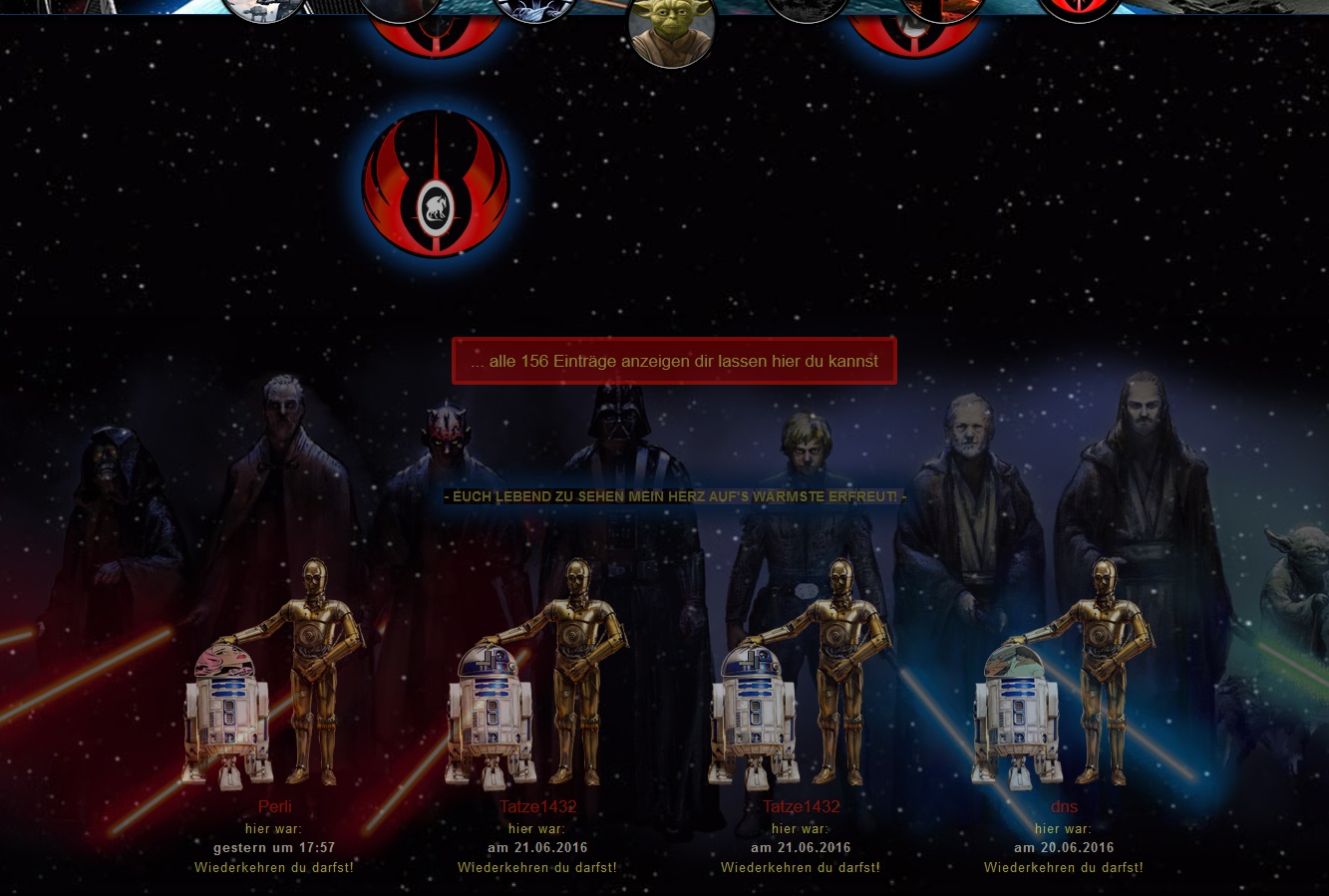
03.02.2016 um 23:07Star Wars | Profil Theme Basic
Passend zum aktuellen Star Wars Fieber habe ich das "Star Wars Basic Theme" fertiggestellt:
Ich will gar nicht viel beschreiben! Einfach mal einbauen und probieren :Y:
Der Code
So long...

Passend zum aktuellen Star Wars Fieber habe ich das "Star Wars Basic Theme" fertiggestellt:
Ich will gar nicht viel beschreiben! Einfach mal einbauen und probieren :Y:
Der Code
<style type="text/css">
/*
STAR WARS BASIC THEME
Author: S_C (https://www.allmystery.de/mitglieder/S_C)
Date: 03.02.2016
*/
/* -----### google fonts ###----- */
@font-face {
font-family: 'Amarante';
font-style: normal;
font-weight: 400;
src: local('Amarante Regular'), local('Amarante-Regular'), url(https://fonts.gstatic.com/s/amarante/v4/mf2HDk-wdi2JEvIxvmwX9vesZW2xOQ-xsNqO47m55DA.woff2) format('woff2');
}
@font-face {
font-family: 'Abel';
font-style: normal;
font-weight: 400;
src: local('Abel'), local('Abel-Regular'), url(https://fonts.gstatic.com/s/abel/v6/brdGGFwqYJxjg2CD1E9o7g.woff2) format('woff2');
}
/* allmy off */
.userfunction,
.header,
.tabnav,
.head_links,
.profile_links,
.profile_pic,
.profile_info,
.infoleiste,
center,
.gb_post_usericon,
h2,
.footer,
.videoWrapper,
iframe {
display: none !important;
}
.profile_posts {
display: block !important;
}
html {
cursor: url('https://static.allmystery.de/upics/73c049_cr.png'), move;
}
body {
font-family: 'Abel', sans-serif !important;
color: #FDF253 !important;
padding-top: 0px !important;
background-color: #000;
background-image: url('https://static.allmystery.de/upics/71e8d4_bg.jpg') !important;
background-repeat: repeat !important;
background-position: center top !important;
background-attachment: fixed !important;
background-size: cover !important;
overflow-x: hidden;
}
.page {
width: 100% !important;
max-width: 100% !important;
min-width: 0px !important;
margin: 0px auto;
padding: 0;
background: transparent;
line-height: 1.5;
}
.main {
width: 100% !important;
max-width: 100% !important;
padding-top: 0px !important;
padding-left: 0px !important;
margin-right: auto !important;
margin-left: auto;
text-align: center;
background: transparent;
}
#show_gb_post_wrap {
font-size: 40px;
color: transparent;
position: relative;
margin: -280px auto 0 auto;
width: 350px;
text-align: center;
visibility: hidden;
}
#show_gb_post_wrap:after {
content: "Eintrag verfassen";
margin: -120px auto 30px auto;
width: 350px;
text-align: center;
visibility: visible;
text-decoration: none;
font-size: 40px;
color: #F6EDD8;
}
ul#gb_posts {
width: 960px !important;
margin: 180px auto 0 auto !important;
position: relative !important;
text-align: center;
}
ul#gb_posts li {
margin-bottom: 20px !important;
width: 450px !important;
margin: 0 15px;
padding-top: 20px;
}
#gb_posts li a.gb_post_img {
width: 150px !important;
height: 150px !important;
text-align: center;
padding: 69px 0px 0px 0px !important;
margin: 0px auto 10px auto !important;
position: relative !important;
display: block !important;
float: none !important;
background: url('https://static.allmystery.de/upics/c9c93a_jedi_logo2.png') no-repeat center;
}
#gb_posts li a.gb_post_img img {
width: 60px !important;
height: 60px !important;
border: 2px solid #DE2101 !important;
-webkit-animation: postimgimg 5s infinite linear;
animation: postimgimg 5s infinite linear;
}
@-webkit-keyframes postimgimg {
from {
-webkit-transform: rotateY(0);
transform: rotateY(0);
}
to {
-webkit-transform: rotateY(360deg);
transform: rotateY(360deg);
}
}
@keyframes postimgimg {
from {
-webkit-transform: rotateY(0);
transform: rotateY(0);
}
to {
-webkit-transform: rotateY(360deg);
transform: rotateY(360deg);
}
}
#gb_posts li a.gb_post_img:hover {
-webkit-transform: scale(1.2, 1.2);
-moz-transform: scale(1.2, 1.2);
-ms-transform: scale(1.2, 1.2);
-o-transform: scale(1.2, 1.2);
transform: scale(1.2, 1.2);
}
#gb_posts li a.gb_post_img:hover + .gb_post_text {
display: block;
-webkit-animation: fadein 2s;
-moz-animation: fadein 2s;
-ms-animation: fadein 2s;
-o-animation: fadein 2s;
animation: fadein 2s;
}
.gb_post_text {
display: none;
}
#gb_posts .gb_post_text {
float: left;
position: relative;
width: 430px;
font-size: 17px;
padding: 0 10px;
}
@keyframes fadein {
from { opacity: 0; }
to { opacity: 1; }
}
@-moz-keyframes fadein {
from { opacity: 0; }
to { opacity: 1; }
}
@-webkit-keyframes fadein {
from { opacity: 0; }
to { opacity: 1; }
}
@-ms-keyframes fadein {
from { opacity: 0; }
to { opacity: 1; }
}
@-o-keyframes fadein {
from { opacity: 0; }
to { opacity: 1; }
}
img.bild {
width: 100%;
max-width: 300px !important;
z-index: 1 !important;
position: relative !important;
margin: 20px auto !important;
display: block !important;
border: 4px solid #F6EDD8;
background-color: #F6EDD8;
font-size: 0;
}
#gb_post_wrap {
width: 470px !important;
height: 70px !important;
margin: 0px auto 120px auto !important;
}
#gb_post_textarea {
padding: 10px !important;
min-height: 135px !important;
border: 1px solid #fff !important;
height: 120px !important;
font-size: 17px !important;
width: 100% !important;
position: relative !important;
margin: 90px auto 30px auto !important;
display: block !important;
left: 0 !important;
-webkit-box-sizing: border-box;
-moz-box-sizing: border-box;
box-sizing: border-box;
background: linear-gradient(130deg, #2B4956, #7AC0C0, #E6E1D0, #E68966, #E8CAAF, #FACB3D, #2DCC70);
background-size: 1000% 1000%;
-webkit-animation: gbfield 20s ease infinite;
-moz-animation: gbfield 20s ease infinite;
animation: gbfield 20s ease infinite;
}
@-webkit-keyframes gbfield {
0% { background-position:0% 50% }
50% { background-position:100% 50% }
100% { background-position:0% 50% }
}
@-moz-keyframes gbfield {
0% { background-position:0% 50% }
50% { background-position:100% 50% }
100% { background-position:0% 50% }
}
@keyframes gbfield {
0% { background-position:0% 50% }
50% { background-position:100% 50% }
100% { background-position:0% 50% }
}
input#gb_post_submit {
height: 135px;
width: 181px;
top: 0px !important;
left: 370px;
color: transparent !important;
font-size: 0px !important;
border: none !important;
background: url("https://static.allmystery.de/upics/bf7cd9_post.png");
opacity: 1;
}
input#gb_post_submit:hover {
cursor: url('https://static.allmystery.de/upics/7f1bb5_cr_hov.png'), move;
opacity: 0.7;
}
a[href^="/mitglieder/"] strong {
color: #F6EDD8 !important;
line-height: normal;
margin: 0px;
}
a[href^="/mitglieder/"] strong:hover {
color: #FDF253 !important;
}
a[href^="/mitglieder/"] strong:after {
content:" schrieb";
font-family: 'Abel', sans-serif !important;
color: #fff !important;
font-size: 14px;
text-shadow: none;
text-transform: none;
margin-top: 10px;
}
#gb_posts .gb_post_text a {
color: #383a3c !important;
font-size: 14px;
width: 220px;
margin: 0 auto;
}
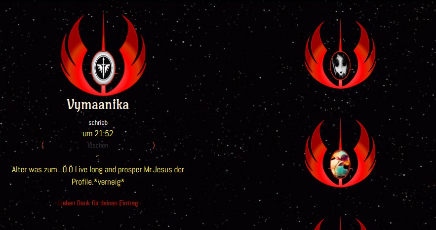
#gb_posts .gb_post_text:before {
content:"";
color: #383a3c !important;
margin: 0px;
}
#gb_posts .gb_post_text:after {
content:"- Lieben Dank für deinen Eintrag -";
font-family: 'Abel', sans-serif !important;
font-weight: 400;
color: #C11700 !important;
font-size: 14px;
margin-top: 20px;
}
small {
color: #D35244;
}
.delete_gb_entry {
color: #D35244 !important;
display: inline-block !important;
}
a:hover {
color: #2B4956;
}
.uicons {
line-height: 17px !important;
transform: scale(1.3);
margin: 0 3px;
}
/* -----### star wars layout ###----- */
* {
box-sizing: border-box;
}
#mobile {
display: none !important;
}
.head {
width: 100%;
height: 100px;
position: fixed;
top: 0px;
left: 0;
background-image: url('https://static.allmystery.de/upics/58509a_bg_menue.jpg');
background-repeat: no-repeat;
background-position: center top;
background-size: cover;
background-attachment: scroll;
border-bottom: solid 1px #0B3565;
z-index: 10000;
}
.container {
max-width: 960px;
margin-left: auto;
margin-right: auto;
padding-left: 10px;
padding-right: 10px;
}
.head .row {
position: relative;
}
.row {
padding-top: 1em;
padding-bottom: 1em;
margin-left: -10px;
margin-right: -10px;
}
nav ul, nav ol {
list-style: outside none none;
padding: 0px;
}
.clear:before, .clear:after {
content: "";
display: table;
}
.clear:after {
clear: both;
}
.clear {
zoom: 1;
}
#thema1, #thema2, #thema3, #thema4, #thema5, #thema6, #memory {
border-top: solid 1px #0B3565;
}
section:before {
content: " ";
margin-top: -100px;
height: 170px;
visibility: hidden;
}
#logo {
width: 150px;
height: 150px;
position: absolute;
top: -100px;
left: 50%;
margin-left: -75px;
z-index: 20;
perspective: 1000;
-webkit-transition: all 2.5s ease-in-out;
-moz-transition: all 2.5s ease-in-out;
-o-transition: all 2.5s ease-in-out;
transition: all 2.5s ease-in-out;
}
#logo:hover {
top: 5px;
background-color: #000;
-webkit-transition: all 2.5s ease-in-out;
-moz-transition: all 2.5s ease-in-out;
-o-transition: all 2.5s ease-in-out;
transition: all 2.5s ease-in-out;
}
#flip_card {
width: 100%;
height: 100%;
transform-style: preserve-3d;
-webkit-transition: all 2.5s linear;
-moz-transition: all 2.5s linear;
-o-transition: all 2.5s linear;
transition: all 2.5s linear;
}
#logo:hover #flip_card {
-webkit-transition: rotateY(180deg);
-moz-transition: rotateY(180deg);
-o-transition: rotateY(180deg);
transform: rotateY(180deg);
}
.face {
position: absolute;
width: 100%;
height: 100%;
backface-visibility: hidden;
}
.face.back {
transform: rotateY(180deg);
color: #fff;
text-align: center;
}
.back-inner {
width: 150px;
height: 150px;
text-align: center;
margin: 0 auto;
background-color: #000;
background-image: url('https://static.allmystery.de/upics/b6f553_heartbeat2.gif');
background-repeat: no-repeat;
background-position: center 73%;
}
.front img {
max-width: 150px;
border-radius: 50%;
cursor: pointer;
}
.back-inner img {
max-width: 150px;
border-radius: 50%;
cursor: pointer;
}
nav ul#main-nav {
margin: 25px 0px;
}
nav ul#main-nav li {
padding: 0px;
width: 14.2%;
font-family: Amarante,Times New Roman,serif;
font-size: 20px;
text-align: center;
float: left;
display: inline-block;
line-height: 48px;
padding: 0px 15px;
}
nav ul#main-nav li a {
color: #F6EDD8;
text-decoration: none;
}
nav ul#main-nav li a:hover {
color: #FDF253;
}
.ctm_main {
padding-top: 50px;
}
.section-inner {
overflow: hidden;
padding: 30px 0px;
background: transparent;
position: relative;
z-index: 0;
}
h3, .h3 {
font-size: 30px;
}
h3 {
line-height: normal;
margin: 0px 0px 0.33em;
}
h3.section-title {
font-family: Amarante,Times New Roman,serif;
font-size: 65px;
margin-bottom: 0px;
text-align: center;
color: #FDF253;
}
.retro {
text-shadow: 3px 3px #000, 3px 2px #FDF253;
}
.gotop {
position: fixed;
right: 2%;
bottom: 2%;
color: #fff;
background-color: #980000;
border: 4px solid #EC0F00;
padding: 10px 17px;
text-decoration: none;
z-index: 100;
font-weight: 600;
opacity: 0.5;
}
.gotop:hover {
opacity: 1;
}
.more_entries_wrap {
max-width: 640px;
float: none !important;
position: relative;
text-align: center;
margin-bottom: 30px !important;
margin-right: auto !important;
margin-left: auto !important;
}
#more_entries_link {
color: #fff;
background-color: #980000;
border: 4px solid #EC0F00;
position: relative;
z-index: 1;
width: auto;
font-size: 17px;
text-align: center;
padding: 10px 15px;
line-height: 2.6;
}
h1 {
color: #F6EDD8;
font-size: 110px;
letter-spacing: 3px;
text-shadow: 3px 3px 0px transparent, 5px 5px 0px #484A4D;
text-align: center;
margin: 0px auto 0px auto;
padding: 0;
}
h1 {
font-family: Amarante,Times New Roman,serif !important;
font-weight: 400;
}
h3,
#show_gb_post_wrap:after,
a[href^="/mitglieder/"] strong {
font-family: Amarante,Times New Roman,serif !important;
font-weight: 400;
}
a[href^="/mitglieder/"] strong {
font-size: 27px;
}
#gb_post_textarea,
a[href^="/mitglieder/"] strong:after,
#gb_posts .gb_post_text:before {
font-family: 'Abel', sans-serif !important;
font-size: 14px !important;
font-weight: 400;
}
#show_gb_post_wrap,
#show_gb_post_wrap:after,
a[href^="/mitglieder/"] strong,
a[href^="/mitglieder/"] strong:after,
#gb_posts .gb_post_text a,
#gb_posts .gb_post_text:before,
#gb_posts .gb_post_text:after,
small,
section:before,
#logo,
.face.back,
.back-inner,
.more_entries_wrap,
nav,
.ctm_main,
section,
h1 {
display: block;
}
a, a:hover,
nav ul#main-nav li, nav ul#main-nav li:hover,
a[href^="/mitglieder/"] strong, a[href^="/mitglieder/"] strong:hover,
.gb_post_text {
-webkit-transition: all 0.2s ease-in-out;
-moz-transition: all 0.2s ease-in-out;
-o-transition: all 0.2s ease-in-out;
transition: all 0.2s ease-in-out;
text-decoration: none;
}
a:hover,
nav ul#main-nav li:hover,
input#gb_post_submit:hover,
a[href^="/mitglieder/"] strong:hover {
cursor: url('https://static.allmystery.de/upics/7f1bb5_cr_hov.png'), move;
}
.back-inner,
.head {
box-shadow: 0px 7px 5px rgba(0, 0, 0, 0.7);
-webkit-box-shadow: 0px 7px 5px rgba(0, 0, 0, 0.7);
-moz-box-shadow: 0px 7px 5px rgba(0, 0, 0, 0.7);
-o-box-shadow: 0px 7px 5px rgba(0, 0, 0, 0.7);
}
#gb_post_textarea {
box-shadow: 0px 0px 20px 10px rgba(12, 87, 170, 0.8), 0px 0px 20px 10px rgba(13, 33, 57, 0.8);
-webkit-box-shadow: 0px 0px 20px 10px rgba(12, 87, 170, 0.8), 0px 0px 20px 10px rgba(13, 33, 57, 0.8);
-moz-box-shadow: 0px 0px 20px 10px rgba(12, 87, 170, 0.8), 0px 0px 20px 10px rgba(13, 33, 57, 0.8);
-o-box-shadow: 0px 0px 20px 10px rgba(12, 87, 170, 0.8), 0px 0px 20px 10px rgba(13, 33, 57, 0.8);
}
img.bild {
box-shadow: 0px 1px 2px rgba(0, 0, 0, 0.5);
-webkit-box-shadow: 0px 1px 2px rgba(0, 0, 0, 0.5);
-moz-box-shadow: 0px 1px 2px rgba(0, 0, 0, 0.5);
-o-box-shadow: 0px 1px 2px rgba(0, 0, 0, 0.5);
}
#gb_posts li a.gb_post_img,
#gb_posts li a.gb_post_img img,
#logo,
.back-inner,
.gotop {
border-radius: 50%;
-webkit-border-radius: 50%;
-moz-border-radius: 50%;
-o-border-radius: 50%;
}
img.bild,
#gb_post_textarea,
#more_entries_link {
border-radius: 3px;
-webkit-border-radius: 3px;
-moz-border-radius: 3px;
-o-border-radius: 3px;
}
a[href^="/mitglieder/"] strong,
nav ul#main-nav li a,
nav ul#main-nav li a:hover {
text-shadow: 1px 1px 1px rgba(0, 0, 0, 0.9);
}
#show_gb_post_wrap:after {
text-shadow: 1px 1px 0px transparent, 3px 3px 0px #484A4D;
}
.emo_box {
width: 100%;
max-width: 470px;
height: 2em;
padding: 5px;
background: transparent;
display: table;
text-align: center;
margin: 100px auto -10px auto;
box-shadow: 0px 0px 1px 0px rgba(0, 0, 0, 0.5) inset;
}
.emos {
width: 100%;
display: table-cell;
vertical-align: middle;
}
.emo {
width: 20px;
height: 20px;
margin: 0 3px;
font-family: 'Symbola';
font-size: 20px;
font-weight: 600;
display: inline-block;
}
.emo_txt {
margin: 0px 3px 5px 3px;
font-family: 'Abel', sans-serif !important;
font-size: 13px;
font-weight: 400;
display: block;
}
.emo_txt a {
font-size: 13px;
font-weight: 400;
color: #F6EDD8;
}
.emo_txt a:hover {
color: #7AC0C0;
}
.gb_post_text .emo {
font-size: 20px !important;
}
.user_view {
height: 244px;
width: 190px;
margin: 30px 40px 30px 30px !important;
float: none !important;
display: inline-block;
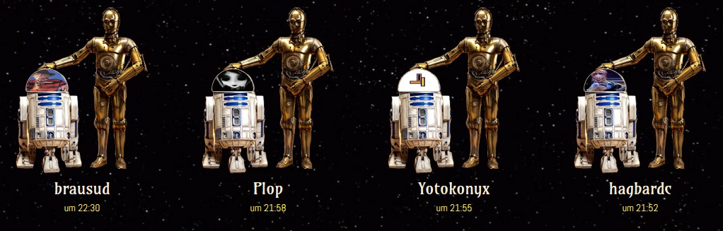
background: transparent url('https://static.allmystery.de/upics/70c748_r2d2_c3po.png') no-repeat center bottom;
padding: 70px 0 0 0;
}
.user_view a img.user_view_pic {
width: 60px !important;
height: 33px !important;
border-radius: 30px 30px 3px 3px;
padding: 0px !important;
border: 1px solid #C8AF8C !important;
margin: 24px 0px 110px -100px !important;
float: none !important;
}
.user_view a {
text-align: center;
width: 190px;
border-radius: 50%;
float: left !important;
font-size: 23px !important;
font-family: Amarante,Times New Roman,serif;
color: rgb(246, 237, 216) !important;
text-shadow: 1px 1px 1px rgba(0, 0, 0, 0.9);
}
.user_view a:hover {
color: #FDF253 !important;
}
.user_view .visited_info {
width: 190px;
font-size: 14px !important;
display: block;
float: left !important;
text-align: center;
margin-top: 0px;
margin-bottom: 30px;
color: #FDF253;
}
a[href^="/mitglieder/"] {
}
/* star wars style */
.starwars {
perspective: 800px;
transform-style: preserve3d;
}
.starwars {
width: 550px;
height: 280px;
margin: 10px auto 0px auto;
position: relative;
text-align: justify;
}
.preline span {
display: inline-block;
}
img {
width: 100%;
}
.star, .wars {
position: absolute;
}
.star {
top: -0.75em;
}
.wars {
bottom: -0.5em;
}
.preline {
font-family: arial, sans-serif;
font-size: 16px;
letter-spacing: 0.2em;
text-align: center;
text-transform: uppercase;
width: 550px;
position: absolute;
margin: 123px auto 0 auto;
}
.animated {
-webkit-animation-duration: 10s;
animation-duration: 10s;
-webkit-animation-fill-mode: both;
animation-fill-mode: both;
}
.star {
animation: star 10s ease-out infinite;
}
.wars {
animation: wars 10s ease-out infinite;
}
.preline span {
animation: spin-letters 10s linear infinite;
}
.preline {
animation: move-byline 10s linear infinite;
}
@keyframes star {
0% {
opacity: 0;
transform: scale(1.5) translateY(-0.75em);
}
20% {
opacity: 1;
}
89% {
opacity: 1;
transform: scale(1);
}
100% {
opacity: 0;
transform: translateZ(-1000em);
}
}
@keyframes wars {
0% {
opacity: 0;
transform: scale(1.5) translateY(0.5em);
}
20% {
opacity: 1;
}
90% {
opacity: 1;
transform: scale(1);
}
100% {
opacity: 0;
transform: translateZ(-1000em);
}
}
/* FadeIn animation */
@-webkit-keyframes fadeIn {
0% {opacity: 0; color: #000;}
100% {opacity: 1; color: #FBFDFB;}
}
@keyframes fadeIn {
0% {opacity: 0; color: #000;}
100% {opacity: 1; color: #FBFDFB;}
}
.preline {
-webkit-animation-name: fadeIn;
animation-name: fadeIn;
}
/* FadeOut animation */
@-webkit-keyframes fadeOut {
0% {opacity: 1;}
100% {opacity: 0;}
}
@keyframes fadeOut{
0% {opacity: 1;}
100% {opacity: 0;}
}
#title {
position: relative;
width: 800px;
height: 500px;
font-size: 350%;
color: #FDF253;
font-weight: 400;
text-align: justify;
overflow: hidden;
margin: -220px auto 0 auto;
-webkit-transform-origin: 50% 100%;
-moz-transform-origin: 50% 100%;
-ms-transform-origin: 50% 100%;
-o-transform-origin: 50% 100%;
transform-origin: 50% 100%;
-webkit-transform: perspective(200px) rotateX(25deg);
-moz-transform: perspective(200px) rotateX(25deg);
-ms-transform: perspective(200px) rotateX(25deg);
-o-transform: perspective(200px) rotateX(25deg);
transform: perspective(200px) rotateX(25deg);
}
#title:after {
position: absolute;
content: ' ';
left: 0;
right: 0;
top: 0;
bottom: 60%;
background-image: -webkit-linear-gradient(top, rgba(0,0,0,1) 0%, transparent 100%);
background-image: -moz-linear-gradient(top, rgba(0,0,0,1) 0%, transparent 100%);
background-image: -ms-linear-gradient(top, rgba(0,0,0,1) 0%, transparent 100%);
background-image: -o-linear-gradient(top, rgba(0,0,0,1) 0%, transparent 100%);
background-image: linear-gradient(top, rgba(0,0,0,1) 0%, transparent 100%);
pointer-events: none;
}
#title_content {
position: absolute;
top: 100%;
-webkit-animation: scroll 100s linear 4s infinite;
-moz-animation: scroll 100s linear 4s infinite;
-ms-animation: scroll 100s linear 4s infinite;
-o-animation: scroll 100s linear 4s infinite;
animation: scroll 100s linear 4s infinite;
}
/* animation */
@-webkit-keyframes scroll {
0% { top: 100%; }
100% { top: -170%; }
}
@-moz-keyframes scroll {
0% { top: 100%; }
100% { top: -170%; }
}
@-ms-keyframes scroll {
0% { top: 100%; }
100% { top: -170%; }
}
@-o-keyframes scroll {
0% { top: 100%; }
100% { top: -170%; }
}
@keyframes scroll {
0% { top: 100%; }
100% { top: -170%; }
}
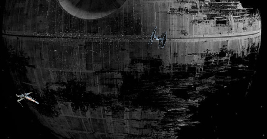
.tie {
-webkit-animation: fly-tie 17s ease-in-out infinite;
-moz-animation: fly-tie 17s ease-in-out infinite;
-o-animation: fly-tie 17s ease-in-out infinite;
animation: fly-tie 17s ease-in-out infinite;
}
.fly-tie {
width: 170px;
height: 170px;
background-image: url('https://static.allmystery.de/upics/0f7dea_tie.png');
background-repeat: no-repeat;
background-size: 50%;
-webkit-transform: translate(100px, 200px);
-moz-transform: translate(100px, 200px);
-o-transform: translate(100px, 200px);
transform: translate(100px, 200px);
}
@-webkit-keyframes infinite-image {
0% { left:0;}
100% { left: -100%;}
}
@-webkit-keyframes fly-tie {
0% {-webkit-transform: translate(100px, 200px);}
30% {-webkit-transform: translate(400px, 300px) scale(1.8) rotate(-35deg) rotateY(90deg);}
60% {-webkit-transform: translate(600px, 50px) scale(0.6) rotate(360deg);}
85% {-webkit-transform: translate(300px, 220px) scale(1) rotate(15deg);}
95% {-webkit-transform: translate(150px, 80px) scale(0.3) rotate(-360deg) rotateY(180deg);}
100% {-webkit-transform: translate(100px, 200px) rotate(0deg);}
}
@-moz-keyframes infinite-image {
0% { left:0;}
100% { left: -100%;}
}
@-moz-keyframes fly-tie {
0% {-moz-transform: translate(100px, 200px);}
30% {-moz-transform: translate(400px, 300px) scale(1.8) rotate(-35deg) rotateY(90deg);}
60% {-moz-transform: translate(600px, 50px) scale(0.6) rotate(360deg);}
85% {-moz-transform: translate(300px, 220px) scale(1) rotate(15deg);}
95% {-moz-transform: translate(150px, 80px) scale(0.3) rotate(-360deg) rotateY(180deg);}
100% {-moz-transform: translate(100px, 200px) rotate(0deg);}
}
@-o-keyframes infinite-image {
0% { left:0;}
100% { left: -100%;}
}
@-o-keyframes fly-tie {
0% {-o-transform: translate(100px, 200px);}
30% {-o-transform: translate(400px, 300px) scale(1.8) rotate(-35deg) rotateY(90deg);}
60% {-o-transform: translate(600px, 50px) scale(0.6) rotate(360deg);}
85% {-o-transform: translate(300px, 220px) scale(1) rotate(15deg);}
95% {-o-transform: translate(150px, 80px) scale(0.3) rotate(-360deg) rotateY(180deg);}
100% {-o-transform: translate(100px, 200px) rotate(0deg);}
}
@keyframes infinite-image {
0% { left:0;}
100% { left: -100%;}
}
@keyframes fly-tie {
0% {transform: translate(100px, 200px);}
30% {transform: translate(400px, 300px) scale(1.8) rotate(-35deg) rotateY(90deg);}
60% {transform: translate(600px, 50px) scale(0.6) rotate(360deg);}
85% {transform: translate(300px, 220px) scale(1) rotate(15deg);}
95% {transform: translate(150px, 80px) scale(0.3) rotate(-360deg) rotateY(180deg);}
100% {transform: translate(100px, 200px) rotate(0deg);}
}
.xwing {
-webkit-animation: fly-xwing 15s ease-in-out infinite;
-moz-animation: fly-xwing 15s ease-in-out infinite;
-o-animation: fly-xwing 15s ease-in-out infinite;
animation: fly-xwing 15s ease-in-out infinite;
}
.fly-xwing {
width: 170px;
height: 170px;
background-image: url('https://static.allmystery.de/upics/a46422_x_wing.png');
background-repeat: no-repeat;
background-size: 50%;
-webkit-transform: translate(100px, 250px);
-moz-transform: translate(100px, 250px);
-o-transform: translate(100px, 250px);
transform: translate(100px, 250px);
}
@-webkit-keyframes infinite-image {
0% { left:0;}
100% { left: -100%;}
}
@-webkit-keyframes fly-xwing {
0% {-webkit-transform: translate(100px, 250px);}
30% {-webkit-transform: translate(450px, 350px) scale(1.8) rotate(35deg) rotateY(90deg);}
60% {-webkit-transform: translate(650px, 100px) scale(0.6) rotate(-360deg);}
85% {-webkit-transform: translate(350px, 270px) scale(1) rotate(-15deg);}
90% {-webkit-transform: translate(200px, 130px) scale(0.3) rotate(360deg) rotateY(180deg);}
100% {-webkit-transform: translate(100px, 250px) rotate(0deg);}
}
@-moz-keyframes infinite-image {
0% { left:0;}
100% { left: -100%;}
}
@-moz-keyframes fly-xwing {
0% {-moz-transform: translate(100px, 250px);}
30% {-moz-transform: translate(450px, 350px) scale(1.8) rotate(35deg) rotateY(90deg);}
60% {-moz-transform: translate(650px, 100px) scale(0.6) rotate(-360deg);}
85% {-moz-transform: translate(350px, 270px) scale(1) rotate(-15deg);}
90% {-moz-transform: translate(200px, 130px) scale(0.3) rotate(360deg) rotateY(180deg);}
100% {-moz-transform: translate(100px, 250px) rotate(0deg);}
}
@-o-keyframes infinite-image {
0% { left:0;}
100% { left: -100%;}
}
@-o-keyframes fly-xwing {
0% {-o-transform: translate(100px, 250px);}
30% {-o-transform: translate(450px, 350px) scale(1.8) rotate(35deg) rotateY(90deg);}
60% {-o-transform: translate(650px, 100px) scale(0.6) rotate(-360deg);}
85% {-o-transform: translate(350px, 270px) scale(1) rotate(-15deg);}
90% {-o-transform: translate(200px, 130px) scale(0.3) rotate(360deg) rotateY(180deg);}
100% {-o-transform: translate(100px, 250px) rotate(0deg);}
}
@keyframes infinite-image {
0% { left:0;}
100% { left: -100%;}
}
@keyframes fly-xwing {
0% {transform: translate(100px, 250px);}
30% {transform: translate(450px, 350px) scale(1.8) rotate(35deg) rotateY(90deg);}
60% {transform: translate(650px, 100px) scale(0.6) rotate(-360deg);}
85% {transform: translate(350px, 270px) scale(1) rotate(-15deg);}
90% {transform: translate(200px, 130px) scale(0.3) rotate(360deg) rotateY(180deg);}
100% {transform: translate(100px, 250px) rotate(0deg);}
}
</style>
[url=https://www.allmystery.de]
[IMG]/static/upics/f4991b_jedi_logo_bck2.png" alt=""/>
[ul][li]<a href="#thema1">Thema 1[/url]
[li][url=#thema2]Thema 2[/url]
[li][url=#thema3]Thema 3[/url]
<li style="margin-top:15px;">[url=#thema4]Thema 4[/url]
[li][url=#thema5]Thema 5[/url]
[li][url=#thema6]Thema 6[/url]
[li][url=#memory]Gästebuch[/url]
[/ul]
[objerror=https%3A%2F%2Fstatic.allmystery.de%2Fupics%2F9781fb_bg_2.jpg]Bild nicht mehr verfügbar[/objerror]
[objerror=https%3A%2F%2Fstatic.allmystery.de%2Fupics%2F30445e_bg3.jpg]Bild nicht mehr verfügbar[/objerror]
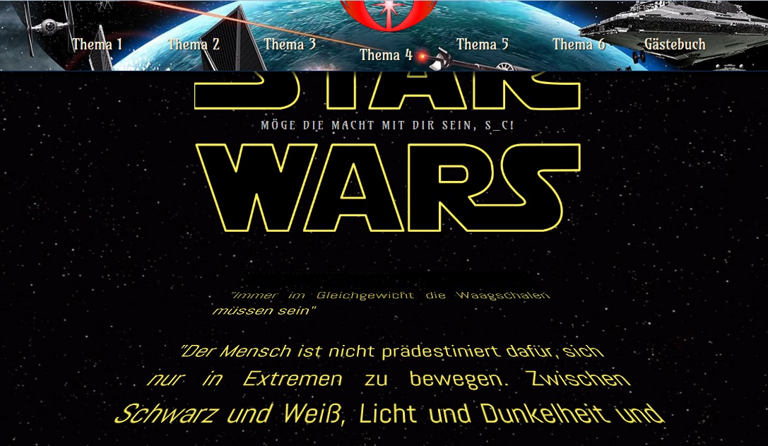
Möge die Macht mit dir sein, $mbesucher![/size]
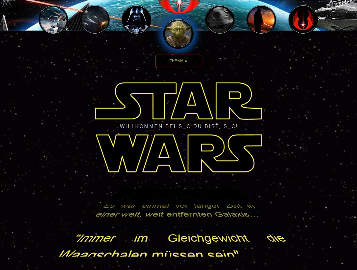
Es war einmal vor langer Zeit in einer weit, weit entfernten Galaxis...
"Immer im Gleichgewicht die Waagschalen müssen sein"
"Der Mensch ist nicht prädestiniert dafür, sich nur in Extremen zu bewegen. Zwischen Schwarz und Weiß, Licht und Dunkelheit und Gut und Böse, gibt es auch eine Mitte. Nur derjenige, welcher sich in der Mitte bewegt, befindet sich auf einem wahrhaften Weg"
"Furcht führt zu Wut, Wut führt zu Hass und Hass führt zu unsäglichem Leid"
"Bekämpfe Feuer weder mit Wasser noch ebenso mit Feuer. Neutralisiere nur seinen Brennstoff und es wird verschwinden"
"Das Mögliche ist nur eine Ablenkung, bis es eintrifft"
"Konzentriere dich auf den Moment, nicht auf die Vergangenheit oder die Zukunft. Denn der Moment bestimmt beides"
"Immer der Moment selbst die Ewigkeit ist"
"Bemühen du dich musst, dann Glück du wirst haben"
Meine Zeit hier ist zu Ende. Nehmt, was ich Euch gelehrt habe, und nutzt es wohl.
Thema 1[/size]
Thema 2[/size]
Thema 3[/size]
Thema 4[/size]
Thema 5[/size]
Thema 6[/size]
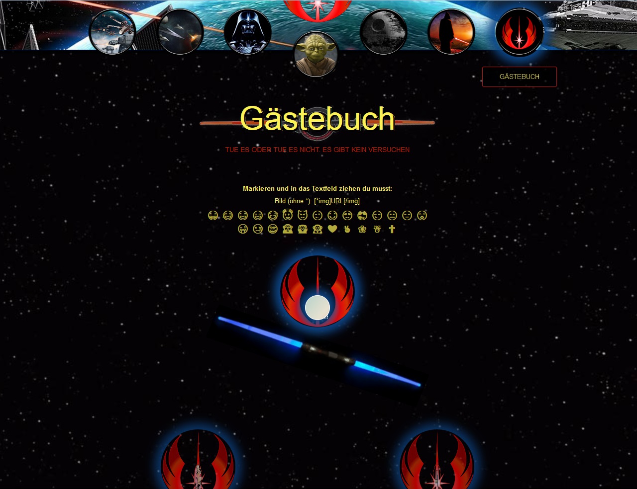
Gästebuch[/size]
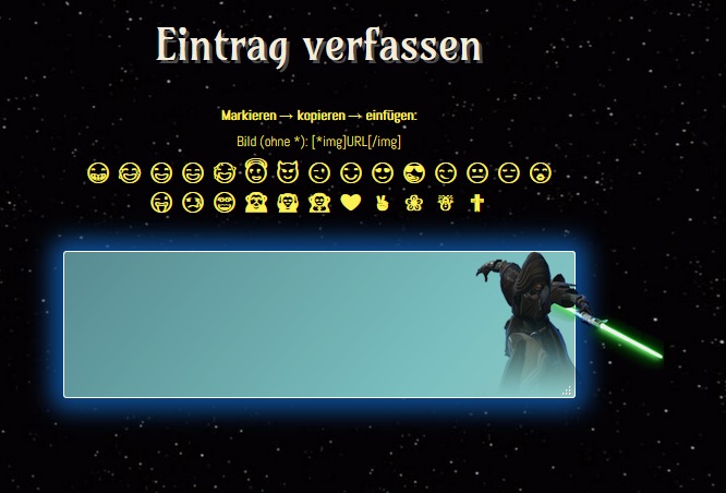
Markieren → kopieren → einfügen:
Bild (ohne *): [*img]URL[/img]
😁
😂
😃
😄
😅
😇
😈
😉
😊
😍
😎
😏
😐
😔
😘
😜
😢
😵
🙈
🙉
🙊
❤
✌
❀
☃
✟
[url=#top]↑[/url]
So long...


